Saturday 28 February 2015

EVALUATION // QUESTION 7

Looking back at your preliminary task, what do you feel you have learnt in the progression from it to the full product?

When considering my preliminary task, i feel that i have progressed when regarding, the final outcomes. There is a clear contrast between my School magazine and my music magazine.


FRONT COVER

In my opinion I feel that I have improved, since my preliminary task of making my school magazine front cover to making my magazine front cover. My front cover of my school magazine does not follow the regular conventions of a magazine, as much as my music magazine. My school magazine front cover is simplistic and follows a plain colour scheme which may not appeal to the audience. Most of the main cover lines of my school magazine are placed at the bottom of the front cover, leaving blank spaces in the center of the magazine. When managing the layout and structure of my school magazine I did not use rulers, on photo shop, and he text of my school magazine was out of line and the structure fairly messy. 
The lack of a sell line and a puff, means that my school magazine, appears fairly simplistic and monotonous, meaning that the front cover would not appeal to the audience, and demand attention. Considering what I am able to do now, I feel that my school magazine front cover does not meet the conventions as well as my music magazine front cover. I feel that I have more knowledge on how a magazine front cover should be structured, and what successful conventions need to be used, to ensure that a front cover appeals to the audience, as a front cover sells a magazine and a company. I have also more knowledge and skill when using specific programs like In-design and Photo shop, as when I started editing my school magazine I had very little knowledge on how to use these programs, and was unable to edit my school magazine to my full potential. As i am now very familiar with Photoshop after creating my school magazine, I was able to use tools that would make my magazine appear more professional and appealing. As it is clear. by observing my school magazine that I did not use professional tools to perfect my school magazine. 
When creating and planning my music magazine front cover, I did lot of research into real music magazine front covers such as NME, and Rolling Stones, magazine. From this research I was able to become inspired by other magazines, and their styles that they used. From the outcome of my music magazine front cover, there are clear relations from my front cover to other front cover from companies like NME. I was also able to identify the regular conventions used by NME magazine, and adopted these conventions and used them when regarding my music magazine. I have used conventions such as the Z theory and the rule of thirds, in order to achieve an appropriate layout of my music magazine front cover. I have also included more details on my music magazine front cover including, date, issue number and website, this promotes my magazine, and the company 'Reflektor', how ever when creating my school magazine, I feel that the masthead, i feel that i did not sell the company and magazine very well. 

Here is the visual contrast of my two different front covers;
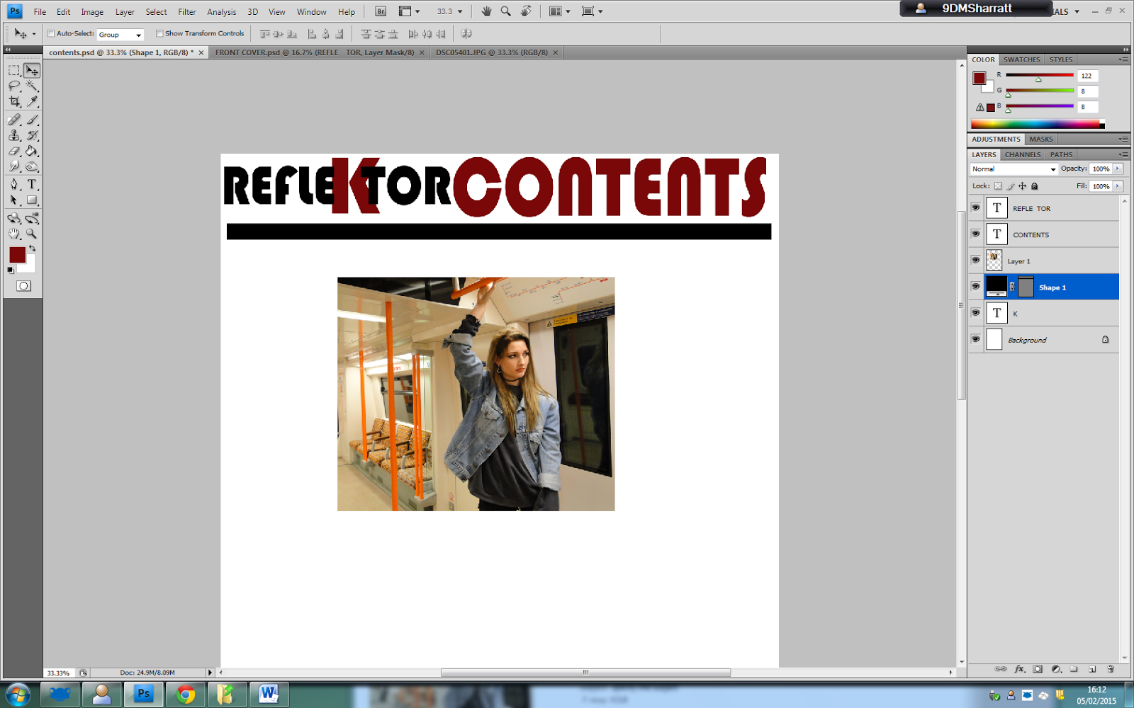


CONTENTS PAGE 

In addition to my front cover, I also created a contents page for my school magazine. Again when comparing my contents page from my preliminary task to my final music magazine, there are clear improvements. In my opinion I feel that creating a contents page for a music magazine was much easier than creating a contents page for a school magazine, this is due to the amount of research I had made on music magazine contents page, and the little research made on contents pages regarding school magazines. 
I can see that my contents page of the preliminary task lacks individuality and style, were as my music magazine is iconic and appealing to the audience. My preliminary contents page lacks a fluent colour scheme, and the all blue background appears to boring and plain. I feel that my contents page lacks clear labels, and is poor at navigating the audience through out the magazine, in contrast to this fault, my music magazine, represents clear labels, and text to help the audience navigate their way through the magazine. I have used a clear, constant colour scheme on my music magazine contents page, and I have shown clear thought of what colours contrast well together. In my school magazine contents page I have shown little knowledge of colour connotation, due to the poor use of colour. 
On the other hand, the contents page includes relevant pictures to do with the magazine, showing that I followed the typical conventions of a school magazine, I have also included a large main image, and thought about the masthead distribution in relation to this. The pictures are in high quality and this is something which I see as very important when regarding making my music magazine. In both magazines i have used a high quality camera, to achieve high quality pictures, this is to ensure that my magazine appears professional and legitimate. In my opinion I believe that my skills have improve and matured after creating my preliminary task, which enabled e to create a professional looking music magazine contents page. During my preliminary task I used Indesign to create my contents page, however for my music magazine I used Photoshop, as after my preliminary task i felt that i worked the best with photo shop. Also photo shop enabled me to create a contents page to the best of my ability. I also believe that my typography skills have improved when observing the contrast of fonts between my school and music magazine. When creating my music magazine i had a keen eye of the type of fonts i was using, and that size and spacing is crucial when designing a font. The improvement of my contents pages shows that planning and research is very important when creating/producing a magazine. As you can see in my music magazine i have including an advert on the bottom of the page, where as in my school magazine there is a lack of features and promotion adverts. This is due to the lack of planning and research before I made my magazine. 

Here is the visual contrast of both my contents pages;


PLANNING AND TIME MANAGEMENT 

During the process of my music magazine, I started planning, since the start of the project, so that my plans are organised. With my music magazine, I organised specific time and dates at least a month prior to my photo shoots. I also gave my models early notice, that I wanted to use them for my magazine. I also created a planning sheet for the day of my photo shoot, on the sheet I included location details and services surrounding the location that i may use, including restaurants public toilets and medical service. I also planned my route to my location before hand, by researching train arrivals and departures. I also planned my magazine theme before hand, knowing that i wanted to take my pictures at a specific location, in which case Shoreditch. I did some research, including famous street art work, that I can use for the background of my double page spread. By visiting my location before the real photo shoot this enabled me to be organised on the official day of my photo shoot was efficient and successful. However when planning for my school magazine, I mostly improvised, and found that I had no clear or structured plan for my location and overall production of my magazine.
During the process of my music magazine, I made a structured planning table showing what I hoped to complete by each week. This plan meant that I was on top of my work and I was able to complete my magazine by the official deadline. However when creating my music magazine, I found that I did panic, and questioned whether I was able to finish the project in time. 


Thursday 26 February 2015

EVALUATION // QUESTION 5


How did you attract/ address your target audience ?

When creating my magazine, I made sure that I attracted my target audience by including bands and other promotions and adverts that would appeal to my audience. On my front cover I included famous indie bands like Wolf Alice and Maximo Park. I also used large fonts so that my audience will notice the famous bands and be attracted to buy my magazine. On the front cover i have included adverts such as 'Free Posters', to attract my audience, as they may be interested in free posters and other gifts inside my magazine. Similarly on my contents page i have included an advert for a new album to appeal to my audience, as my audience are interested in new music and releases. Through out my magazine i have used colloquial language to, attract my audience. Using relaxed language makes my magazine easier to read. My magazine is written in an informal way, to relate and appeal to my young audience of ages 17 - 25.
When choosing my model for my magazine, I wanted to choose someone who had a similar style to my target audience. My friend Jess, has a very unique style which relates to my target audience. Jess' style is inspired by 90's grunge and is very appealing to my target audience. Jess has many piercings and has an interesting contemporary style. Jess' style also relates to other female indie artists who are very successful in the music industry such as Sky Ferraira and Lana Del Rey. Therefore using Jess as my main character for my magazine allows my audience to be interested by her image and style, meaning that more of my audience will be intrigued by the issue, and want to buy the magazine to read more. This 'indie', 'hipster', style is very popular to my target audience, as the audience like to discover new unique styles and music. My target audience, are a little abstract and unique, in contrast to mainstream fans, of pop and hip - hop music, my magazine presents a unique style which will appeal to indie hipster audiences, and make them want to buy the magazine. 
When considering the conventions of my magazine i have used a fluent colour scheme, which is aesthetically pleasing to the audience. The text in my magazine is easy to read, and my magazine presents a constant font theme throughout out. I have created a logo which audiences will be able to recognise as it is unique and different, the large "K", will be recognisable to the reader when the magazine is released in superstores. 


Tuesday 24 February 2015

EVALUATION // QUESTION 3


The media institution that I think is the appropriate for my magazine, is IPC media. I have chosen IPC media, as I have presented in my short film, NME is sold for £2.00, this is very similiar to my magazine, and I feel that NME has gained much success, due to its other social media connected sites, this ensures that my magazine has potential to become very successful. Bauer media already produces many music magazines such as Kerrang and Q, which are both very similar to my magazine, I feel that my magazine will be over looked if it was to be published by Bauer media and their would be great compitition between my brand and other magazines promoting the same genre of music, IPC media only publishes NME, as a music magazine. IPC media would give my magazine greater opportunities to ensure that my magazine is successful, and gains a high readership. They are currently one of the leading media institutions in the UK alone, and up to 26 million adults read a magazine published buy IPC media. My magazine, being aimed at mostly aimed at teenagers and adults, has a higher chance of being successful in the media, and to my target audience. IPC media offers its products to be published over a wide range of media including online issues, this will ensure that my audience grows, and encourages a younger audience to keep up to date with technology, whilst also attracting the younger part of my audience ages, 17 - 23, who are spending most of their time online.
IPC media's distribution methods will allow my magazine to appeal to all ages of my audience, especially as my target audience are young and spend most of their time online, the use of an online issue will be very convenient for my brand.

Friday 20 February 2015

Thursday 19 February 2015

EVALUATION // QUESTION 1

 In what ways does your media product use, develop or challenge forms and conventions of real media products?

Wednesday 18 February 2015

FINAL OUT COME // DOUBLE PAGE SPREAD


FINAL OUT COME // CONTENTS PAGE


FINAL OUT COME // FRONT COVER


PROGRESSION // DOUBLE PAGE SPREAD.


For my double page spread I will be creating a film strip to include some photos of my model. I will be researching on google images for film strip templates to use on my double page spread. 


PROGRESSION//CONTENTS


Here are some screen shots of my progression of my contents page. Here i am experimenting with the style of my contents page, using my logo efficiently, and following the typical conventions of a contents page. 


Here i have added a black text box behind the word contents to make my contents page stand out to the reader. The red contrasts against the black, which is effective, when the reader studies the contents page.


I am making an advert to present on my contents page to make the page appear more interesting and have more content. 


PROGRESSION // FRONT COVER

I have started to edit my front cover on Photoshop. I used photo shop as i have already used it previously when creating my school magazine. Photoshop is perfect software as it has tools that enable me to touch up my photos and make sure that my front cover looks professional. the use of photoshop means that I can carry out many techniques to make my magazine appear professional. 


Here I have changed, "I am not a quitter ",to "Id like to think I am fearless", as i think it is far more professional, for my magazine. I have enlarged 'Fearless', so that it appeals to the reader. 

I have created my own barcode, to use on the front cover of my magazine. The barcode will include details to do with the magazine, like the date and price.  


Tuesday 3 February 2015

Double-page Sread Article content.

I have created an article to use of my double page spread, hat relates to the front cover image and relates to the genre of the magazine. I have conducted appropriate questions that my target audience would like to know about a certain indie artist and or band.


ARTICLE CONTENT


How different is your life now due to your music career?


Yes, it’s a big change from chilling in my basement with my friends most Saturday evenings, to gigging every weekend and releasing a debut album. But it’s a good different, all I have ever wanted to do is write music and play gigs, so I guess as cliché as it sounds, it is a dream come true. I couldn’t believe that my album was on sale at Rough trade. I used to go into rough trade and by all my vinyls from there, and to see my record on sale next to legends like The Smiths and Joy Division, its quite hard to believe really.


How would you define your music?


I have always said that I hate labeling music to a certain genre or type, my music doesn’t stick to a certain type of genre I suppose. I feel that music shouldn’t be defined or stereotyped as a certain genre. However, I think that my music could be defined as indie/psychedelic rock. I think that I would like to switch up genres with my future music. I think that sometimes when artists stick to one genre it can become predictable and boring, and I don’t want to be like every other artist.


Who are your inspirations and influences?


A band that made me start to write and consider making music was The Stone Roses, as a young girl my dad actually had “Waterfall”, on vinyl, it was my favorite roses tune, and still is. They were the first band that I really got into I suppose. When I was about 12 I learnt how to play, “I Wanna be Adored”, on bass guitar, which was a massive achievement at the time!
But current bands that I listen to that still inspire me have to be Daughter, Haim and Lana Del Rey. I think that Lana has a beautiful voice, and her music is amazing!


How do you feel about entering the world of music?


I’d like to say I am fearless. At first I was intimidated, and anxious about releasing the new single, and what feedback it would receive, or even if I would gain any feedback at all. Nevertheless I did make a promise to myself that whatever the outcome of the feedback, I would not stop trying. I am not a quitter, and I hate quitters. I’d also like to think of myself as a strong female in the music industry, as I know that women can be portrayed badly through out the music scene. I also was aware of the criticism that I was going to receive, as I am not going to be every one’s cup-of-tea, and I was, and still am, fully aware of that. But yes of course I was pretty anxious when entering such big industry because of the consequences, I had to pretty much stop all my studies and give my life to music, but I am so happy that I did because music has become my life now, and I am doing what I love.


What is the significance to your new single‘Old street’?


Shoreditch is my favorite place. I love hanging out there with my friends, because it is the most interesting, place in London, I love the street art, the coffee shops and the record shops. So the significance to Old Street, stems from my stories of when I used to spend most of my Saturday afternoons in Shoreditch. Writing the song makes me feel very nostalgic, as it does performing. I didn’t want to write a song, complaining about my ex boyfriends and relationship troubles, like most typical female artists my age. I wanted to write something, which relates to my adolescence years. Old Street basically just represents my memories that took place on Old street, and other places in and around Shoreditch. 

Monday 2 February 2015

FONT IDEAS

I have researched into different font that i will use for my masthead. I have chosen four possible font for my magazine. All fonts follow a bold theme. The font that I will use will have to be bold and simple yet significant to my magazine and my audience. I have used social media sites to decipher the type of font that I will use for my magazine, whilst also discussing with a focus group, to gain opinions from my chosen target audience.


SOCIAL MEDIA FEEDBACK
I used imessage to gain feedback for an appropriate font type, here are my results:


It is apparent that the first font is favored the most out of the four possible fonts


FOCUS GROUP FEEDBACK 
Vicky 
Isabel
Josh
Rachel
After discussing the choice of font with a focus group, the most favored font was the first font. As most of my audience suggested that it was different and had not been used on other magazines in the media. Isabel suggested that it was also easy to read, and could be read from a far distance, as it is both simple yet eye catching. Vicky suggested that the font looked eye catching and appealing in uppercase. As of this, I have come to a conclusion that my font with remain in uppercase. Josh noted that I should maybe alter the font to make it appear more interesting, in addition to this comment, Rachel suggested that I could do this by enlarging a certain letter, or altering the colour of certain letters. In conclusion to these comments, I then decided to enlarge the letter K in the word REFLEKTOR, as I feel that this would add diversity to my mast head, whilst creating an iconic logo. My future audience will be able to recognize my logo and brand more efficiently.
I have tried samples of my new logo/masthead and I am pleased with the outcome. After editing my samples I then presented them to my audience/focus group, to gain some constructive criticism.


Vicky noted that the first font type was neat and accurate, and more 'streamline', however Isabel suggested that the first font sample was boring and, 'didn't shout REFLEKTOR', where as the second font sample was more eye catching and easier to read. In conclusion to this I will be using the second font sample for my final outcome, I have also decided that i would like to alter the colour of the K, as it will suggest the significance and identity of the logo/masthead. The colour of the font will follow the colour scheme of the front cover overall.


EXTRA IMAGES FOR CONTENTS PAGE // MODELS AND LOCATIONS

For my contents page I need more images to make the page seem interesting and appealing. I attended a gig, and took pictures of a live band, that I can use for my contents page and front cover for extra images.
LOCATION
The location of the gig was Camden's Electric Ballroom, a small venue located on Camden high street.
Using this image will make my magazine seem more realistic and appealing to my audience. Gig reviews are a big part of my magazine articles.


CHOSEN MAIN IMAGES

FRONT COVER IMAGE 


CONTENTS PAGE MAIN IMAGE 


MAIN DOUBLE PAGE SPREAD IMAGE