Here are some screen shots of my progression of my contents page. Here i am experimenting with the style of my contents page, using my logo efficiently, and following the typical conventions of a contents page.

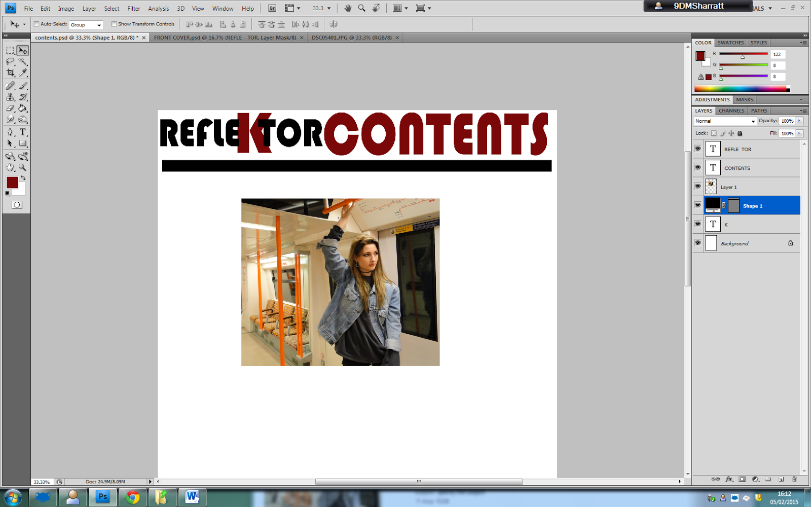

 Here i have added a black text box behind the word contents to make my contents page stand out to the reader. The red contrasts against the black, which is effective, when the reader studies the contents page.

 I am making an advert to present on my contents page to make the page appear more interesting and have more content.

No comments:
Post a Comment