Thursday, 29 January 2015

WHAT IS REFLEKTOR// AN INTRODUCTION TO MY BRAND

AN INTRODUCTION TO REFLEKTOR

So, what is Reflektor? Reflektor is a monthly published Music Magazine, created in December 2014. Reflektor is largely associated with indie alternative music and culture. Every month new articles are released, promoting new music and artists associated with Indie/Alternative music. The media is in desperate need for something new and exciting. Reflektor is new and fresh and will appeal to a certain type of audience. Reflektor can be accessed on line through social media as well as a monthly issued magazine. Reflektor can be found on sites such as, Twitter, Instagram and Youtube, for weekly videos and new music digitally.

AUDIENCE

Reflektor is aimed at those who are interested in new upcoming events and indie alternative music. My audience's age ranges from 17 and up, this is because of the mode of address my magazine portrays. My mode of address is presented as third person, so it addresses the audience. Using directive and interactive words such as, 'YOU', to draw the readers attention. Like other magazines, Reflektors style of mode of address is sarcastic and humorous. The laid back vocabulary and style of my articles makes it easier for the audience to relate to my magazine.
My audience will be mostly interested in music and culture, Reflektor does not follow the celebrity culture of other pop magazines, but sticks to the importance of music, new and old. Reflektor will be aimed at both genders, as my magazine is not aimed at one gender. Therefore the colour scheme of my magazine will appeal to both male and female audiences.
Overall, Reflektor will appeal to those who have an interest in indie alternative music, that is either current, or dated. The logo and colour scheme, will be apparent that the magazine is associated with indie music, to ensure that people who are interested in the certain genre, will be captivated by Reflektor.

HOUSE STYLE


PUBLISHING HOUSE

An appropriate publishing house for Reflektor, is IPC media. IPC media own a vast range of music magazines such as the famous indie rock magazine NME. I feel that this publishing house would be appropriate for publishing my magazine, as it is successful, selling over 350 million copies a year, whilst also supporting other famous indie rock magazines like NME.

Monday, 26 January 2015

FOURTH PHOTO SHOOT // FRONT COVER

For my front cover I took pictures focusing from the waist and upwards. It is important that my model has full eye contact with the camera and all times, so that my front cover will intrigue the audience, and draw attention. Here are some of the pictures that I will consider using for my front cover. I will be editing the photos to ensure that there are no unintentional shadows. I will also be cropping the image so it fits the shape of a magazine.


FOCUS GROUP // SOCIAL MEDIA FEEDBACK INVOLVING POSSIBLE PHOTOS.

I composed a focus group to help decipher which photo I will be using for my front cover. The audience that I aksed for opinions are close to my particular target audience which includes 17 years and above who are interested in indie music.
Here is some of the feedback that i received from twitter.


From the feedback of social media, I have concluded that the most popular image with my audience is image D. Therefor this will be the image that I will use for my magazine. Most of my audience suggested that D is more engaging for the reader. Image D also appears more interesting and appealing to the audience. The image also allows space for the cover lines and logo. This is an appropriate image for REFLEKTOR.  


FRONT COVER PREPARATION

After taking photos for my contents age and double page spread, I then organised with my model, a date to take pictures for my front cover. I arrange an appropriate time and date with my model.


BACKGROUND 

I will be using a white back drop as i earlier discussed that I would prefer my front cover background, to be white, as it will be easier to edit, and front cover lines and mastheads will be easier to read. Here is the specific white backdrop that i will be using.  


PREPARATION FOR SHOOT//MAKE UP 

I will be using the same make-up style for my front cover. I have taken pictures of my stylist, creating a subtle grunge look on Jessica, to show the progression of her make up look.


THIRD PHOTO SHOOT // ROUGH TRADE BRICKLANE


WHAT AM I THINKING?

With these selection of photos I was thinking about using as little images for my DOUBLE PAGE SPREAD and CONTENTS PAGE. I was thinking that I could use these images to support the article in my double page spread. The photos show my model listening to her favourite bands and inspirations. These photos fit with my theme and genre of Reflektor. 

SECOND PHOTO SHOOT // GRAFFITI WALLS SHOREDITCH


WHAT AM I THINKING?

As I planned I will be using some of the street art of Shoreditch as a background for my photos. I am pleased with how the photos came out. I already have an idea of what photos I will use for my double page spread and contents page. I have also tried to include significant ideas of the location, suggested through the photos. For example I tool a photo of my model standing beside a street post, this suggests the location and familiarity towards the audience.

FIRST PHOTO SHOOT // TRAINS (DLR)

I have successfully taken pictures for my double page spread. I am going to present a my photos then ask a selected group of people, to feedback on the pictures that I have taken.

The first selection of photos that i took of my model, were on the train, or to be specific the DLR. Here are a few sample photos that i took, on the train. 

WHAT AM I THINKING?

I am happy with the way my photos came out, however i am still unsure if i would like to use these for my double page spread, I feel that these photos will be more appropriate on my contents page, or as smaller images on my double page spread or front cover. However i am still unsure of which photo to use for my double page spread. 


Saturday, 24 January 2015

BEHIND THE SCENES // SHOREDITCH

I was able to arrange a date with my model, and took some photos for my Double Page spread and Contents page. Whilst taking photos of my model, some of my peers captured some behind the scenes photos, of the shoot. These images show how I was able to communicate with my model during the shoot.  The images also show me using equipment, and trying different techniques when creating photos.

Equipment Used

For my photoshoots, I have used equipment, inorder for my photos to look professional and legitimate. The camera i used, was SONY DSC-HX1, a High Definition camera and recorder. I have tested my camera to make sure that it functions well, ready for my photo shoot. I will also be using a tripod to ensure that my photos are straight, whilst also preventing my pictures from becoming blurry.


LIGHTING AND BACKGROUND

For my front cover I will be using a white backdrop, as a background. The white background makes it easier for the audience to read cover lines and mastheads. The colour white is clean and appealing to the audience and also works with most colour schemes. For my pictures to come out well I will be using large white lights, so the lighting of the pictures are not dark or too over exposed. 

This lighting equipment as you can see will ensure that my photos will turn out successful, and professional. Professional equipment is crucial when creating a magazine, as the audience will be drawn to issues that are produced professionally and carefully. 


Thursday, 22 January 2015

Front Cover Preparations

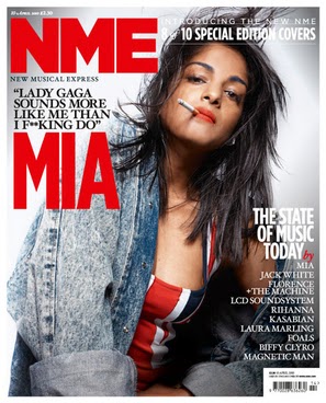
After researching front covers of indie magazines i have noticed that almost all front covers use a plain block coloured background. Indie magazines like NME, tend to use white coloured backgrounds as it fits with the genre of the magazine. Also a white background makes it easier when editing cover lines and mastheads. When creating my front cover I will use a white backdrop, in order to follow the conventions of an indie magazine For my front cover I will be using an white background as contrast against my double page spread, photos. I will be using a white background for my front cover as this makes it easier for mastheads  and cover lines to be seen. I have gathered some front covers that inspire my magazine, REFLEKTOR. A white background also looks cleaner, and more professional. The white background enables me to carry out my colour scheme with ease, as white acts as a blank canvas to other colours. The colour scheme involves up to 3 colours, white being the background of the image. The white back ground contrasts against the bold red mast head. I plan on using a white background so i am able to edit the magazine with ease.


Saturday, 17 January 2015

Meet My Model

My model is Jessica. I have chosen Jessica to model for my magazine as a feel that her personal style fits the theme and genre of my magazine. Jessica's style is influenced by late 90's grunge. Smart, original and diverse, Jessica's style is heavily influenced by her music taste and genre, this helps to fit with the style of my magazine, as Jessica's preferred music genre is indie/alternative/grunge.


STYLING JESSICA


 Before my photo shoot I practiced some makeup looks on Jessica, which i may use for the day of my shoot. Following the idea of fashion icons such as Lana Del Rey, Haim and Sky Ferreira are big influences of this make-up and hair look, however I have changed the look slightly to show Jessica's personal style. I have kept aspects such as Jessica's facial piercing to portray individuality and to convey Jessica's personal style and identity. I took more photos, including head shots, to show the hair style and facial make up that I will use for my magazine.


MAKE-UP 


After styling Jessica's hair and make-up, I then looked into her fashion sense and style, and collected pieces that would suit the style of Jessica whilst also being inspired by certain artists. The style I researched previously was soft/grunge, which included casual pieces such as shorts,baggy jumpers, and denim items. I picked out pieces that fit the theme and genre.


COSTUMES THAT I WILL USE


OUTFIT ONE 


OUTFIT 2


OUTFIT THREE


These are the clothing items that I will be using to style my model Jessica. As you can see the pieces are similar to the styles that i have previously researched however again i have adapted Jessica's style.  The monochrome style fits with the grunge theme of my magazine. If the clothing of the model fits the style and miss en scene of the magazine the more likely the magazine will appeal to a certain audience. If my model was inappropriately dressed for the style and theme of the magazine, it would not work and appear odd. That is why i have chosen dark coloured clothing pieces, that represent the genre of music the artist produces. I will be using three outfit changes so that my magazine appeals to my target audience.

ACCESSORIES 


 I have captured some images of the accessories i will be using, during my photo shoot. Accessories are crucial as they define the model's personality, and identity. Accessories add more definition to the outfits, to make them appear more intriguing.
I will be using the three different outfits in my photoshoot.

SOCIAL MEDIA FEEDBACK // MAKE UP STYLE
After gaining much feed back from social media, most of the comments I received suggested that the make up look, worked best if the red lipstick was not used so the look is kept more subtle, and a nude lipstick should be used. Therefore when recreating my make up look i will use dramatic eye make up with nude lips, to evoke a more grunge effect.